
The Designer Experiment (Part 1)
What Designer is & how it works

I built an agentic UX design harness - Designer.
A few weeks ago I closed The Visible Layer with a claim. The claim: the surface layer of design (UI) has been commodified, but the work that actually decides whether a final design is any good (problem definition, framing, flow, exploration) sits upstream of where the current tools operate, and almost nobody is building there.
This is an upstream experiment, a tool called Designer. And this is part one: what it is and how it works. Part two will be my analysis of what worked, what didn’t, and what I’d do differently.
Good design comes from a good design process
Quick recap. Lovable, v0, Stitch, and Claude Design focus on UI. Prompt in a sentence: get a plausible interface out. Remarkable, and also narrower than it looks. They all work downstream of the real work. They accept whatever framing arrived in the prompt. The object model is implicit and undocumented. The flows are inferred from what the category usually looks like, not from what this user’s task actually is.
Ask for “a notes app” and you get the average. Apple-Notes-shaped: clean, capable, theory-free. The chrome is right. The point of view is missing because nobody took one.
Karri Saarinen said it cleanly: output isn’t design. The form is the easy part now. What’s left is deciding what should exist at all, and that’s still mostly manual, mostly senior, and mostly untouched by the tools.
So here’s the question I wanted to explore. What would a tool look like if it modeled the UX process? Not “make me a screen,” but “given this problem and this user, what are the genuinely different bets worth making, and which one actually holds up?”
What Designer is
Designer is a canvas. Not a chat box with a preview pane, but a left-to-right workspace where each node represents a part of the design process.
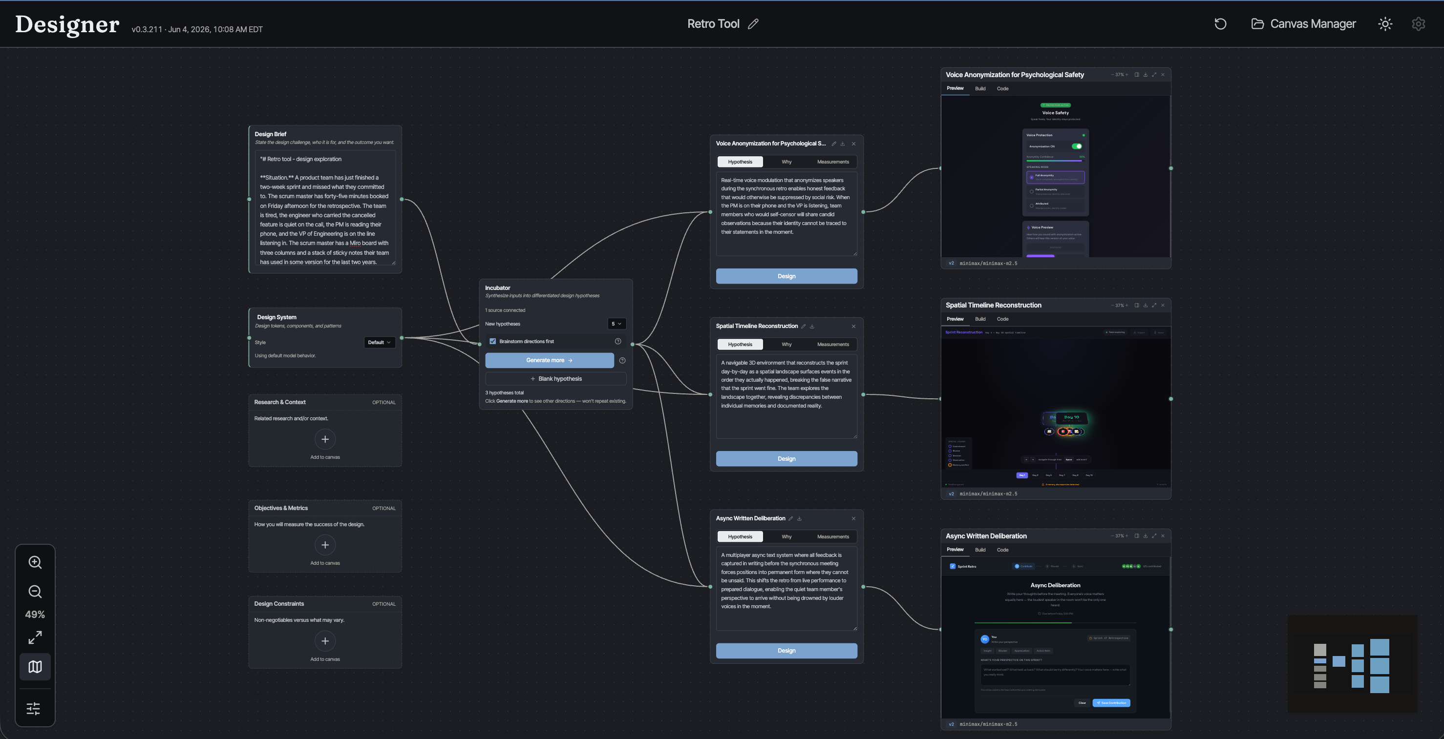
On the left, the inputs - problem, research, etc. In the middle, the design hypothesis incubator / idea generator. On the right, the design hypotheses, and then the designs themselves. Left to right, the canvas is the design process.
We’ll start on the left, with the framing, because that’s where Designer starts, and it’s the part the other tools skip.
The shape of the canvas is the argument. A design is not a screen you generate. It’s a system you reason about (inputs, positions, artifacts, judgment), and the tool should make that whole chain visible. Eliel Saarinen again: always design a thing by considering it in its next larger context. The canvas is that instinct turned into software.
Framing the Design Problem
Five inputs feed the canvas, but only the design brief is actually required.
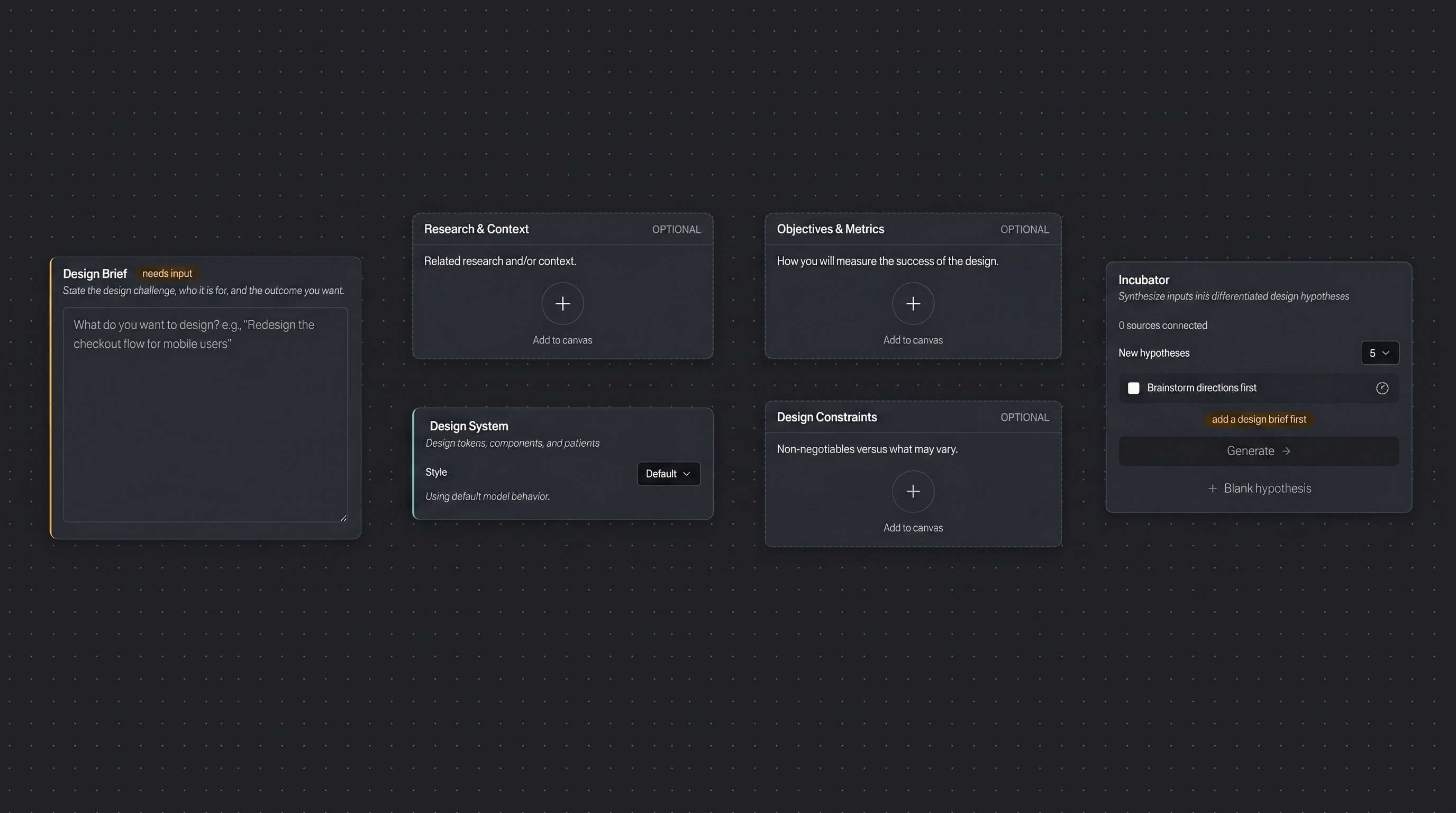
Design Brief. The directive: the challenge, the problem, or the opportunity. It’s the one input every tool already takes, just a sentence in a box. The difference is what happens next. Here the brief is a seed for the rest of the framing, not the whole of it.
Research & Context. Who the audience actually is, what they use today and how it fails them, where the real opportunity sits. Strategic grounding. The kind that decides which directions are even worth pursuing. Designer can draft a first pass from the brief, but it’s deliberately disciplined: no invented studies, no fake statistics, no drifting.
Objectives & Metrics. Not business metrics like KPIs, e.g., conversion and retention. Those live downstream of a shipped product, and nothing has shipped yet. These are design properties a reviewer (or another AI) can judge from the artifact itself, each paired with how it fails when overdone. You’re defining what good looks like, in design terms, before a design exists.
Design Constraints. Not the execution rules the name might suggest, the contrast ratios, type scales, and touch-target sizes. Designer treats those as build-time craft, handled later. Constraints here are strategic: what decides which directions are even viable. The section opens by declaring the surface (a phone, a desktop tool, a kiosk, a voice flow), naming the real deal-breakers (the regulation that applies, the audience composition you have to reach), and separating the hard non-negotiables from the space that’s open to explore. Less a fence around the pixels than a filter on which bets are worth making at all.
Design System. Optional, and pointedly downstream. If you have a visual identity (tokens, type, components), Designer normalizes it into a portable spec and hands it to the designs, not the strategy. The surface layer (the commodified part) is treated as exactly that: an input you plug in, not the work. The hypothesis takes its position first. The system just dresses it.
Three of these (research, objectives, constraints) Designer allows the user to generate draft versions from the brief if you let it, so a thin start doesn’t stay thin. But this relies on what the large language model knows about the domain, and it’s going to be subject to the same kinds of hallucinations we’re already familiar with. Use with caution. These are better completed with real, hard-earned domain knowledge and verifiable facts.
Hypotheses, not variations
This is the heart of Designer. Can it generate plausible, viable, valuable design hypotheses?
Feed the Incubator your brief and it doesn’t return five versions of the same page. It returns hypotheses: genuinely different bets about what will work for this user and this problem.
Take the notes app. Instead of one generic answer, you’d get distinct positions: a block-composition bet where the unit is a block and pages become databases (Notion’s theory of thinking); a plain-text-you-own bet where files live in a vault forever (Obsidian’s); a deliberate zero-structure capture bet, fast and frictionless, chosen on purpose rather than by default. Three different products, each taking a position on what notes are for. Designer surfaces those positions instead of quietly collapsing into one.
And they’re spread on purpose. Each hypothesis sits at a distinct point along exploration axes, the dimensions along which the solutions could meaningfully differ. The Incubator maps that space first, then places bets across it, so you get spread, not noise. Ask for more and it excludes the ones you already have, pushing into new territory instead of circling the average.
There’s an optional first move here too, a checkbox called Brainstorm directions first, off by default. Turn it on and Designer runs a divergent pass before the incubator even starts: brainstorm 10 to 15 deliberately obtuse product directions, no filtering for plausibility, the stranger the better. Then a curation pass converges, keeping the five with the widest spread and reshaping or dropping anything that isn’t genuinely a software product. Those five seed the hypotheses. It’s an extra step, off by default, there for when you want to cast a wider net before the incubator commits.
This is the take a position problem from The Visible Layer, turned into a mechanism. And it’s the bounding box from [New Rules]: before you build anything, you define the space you’re going to explore. You’re not designing a screen. You’re designing the boundaries of which screens could exist.
Exploring the solution space
Pick a hypothesis, hit Design, and Designer builds it. A working static prototype. HTML, CSS, and JavaScript. Clickable, navigable, the interactions run.
Because the marginal cost of a build is low, you don’t have to commit. Run several hypotheses in parallel. Build the same one twice and compare. Results stack as versions (v1, v2), so exploration accumulates instead of overwriting itself.
This is the move I argued for in New Rules: when generation is cheap, you explore the solution space directly rather than through proxies. Three approaches instead of one. The cost of being wrong early drops to near nothing.
But a build isn’t one shot, and that’s what separates it from a prompt-to-page toy. It’s an agent. It plans, writes files, checks its own work, and fixes what it broke. Before it writes a line of code, the agent commits to a plan: which features are needed to verify the hypothesis and which are scaffolds, visibly present but openly inert. What you get is a prototype where the parts that claim to work, work. The trick is building enough of a prototype to be able to prove out the hypothesis, or not.
Which brings me to design iterations and self-improvement.
Evaluation is the bounding box
A polished page no longer proves anything. The screen looks the same whether someone spent three weeks understanding the user or three minutes describing one to a model. So Designer doesn’t trust the surface. It evaluates.
Turn on Auto-improve, and every build gets scored. Against rubrics, not vibes. Design quality. Fidelity to the hypothesis: did the artifact actually express the position it was supposed to take? Implementation quality. A headless browser even renders the thing and checks that it works: console errors, broken images, layout.
Then it revises. The evaluation produces a fix list, the agent applies it, and the loop runs again. It’s bounded. It stops when the design clears the bar you set, or when it hits a ceiling. You define good before the variant exists, and the system converges toward it. A small, designer-controlled version of the Darwinian loop - hypothesize, build, judge, keep the best.
A note on what Designer is not
Designer is a pair designer. Not a replacement, and not a researcher. It does not talk to your users. It will happily generate a beautiful, confident answer to the wrong question. The framing is only ever as good as what you bring to it. The average is a gravity well, too. Left loose, even a hypothesis engine drifts toward the category default, and a lot of the work has gone into pulling against that. And a working prototype is still a prototype. It’s an argument you can click, not a shipped product.
Which is exactly the right place for it to sit. The scarce skills (the ones that stay scarce when generation is cheap) are the ones I keep landing on: understanding what users actually need, articulating it precisely, and the judgment to know when the numbers, or the pretty screen, are lying.
How it’s put together (for the technically curious)
Skip this if you don’t care how the sausage is made.
The build agent runs on an agentic coding harness (Pi) inside an isolated, in-memory sandbox. The agent gets file tools and a shell, like a developer in a tiny disposable VM, but with no network and no package installs. Just the craft of assembling the artifact, then validating its own HTML and JavaScript before it calls the work done.
The design judgment isn’t hard-coded. It lives in a library of prompts and skills (skill.md) the agent loads as it works: design quality, accessibility, and the discipline of using patterns rather than reinventing them. This is the rules of use point from The Visible Layer: a component library is inventory; the value is the governing logic. I tried to write that logic down and experimented with the various prompts.
Around it sits a server that orchestrates each run, streams progress to the canvas live, and runs evaluation as independent rubric workers plus that headless browser. Everything the agent produces is a real file tree you can preview, inspect, and download. That said, there is no follow-up, there is no re-prompt, and that’s a real limitation, and something I’ll return to in part two of this where I get to what worked and what did not.
That’s the architecture in a paragraph. The interesting engineering is in the details: the sandbox boundary, how positions are kept genuinely distinct, and how evaluation feeds revision. That’s a post of its own.
What’s next
This was part one: what Designer is. Part two is the part I’m most interested in writing: what I learned from building and using it. More soon.